
Behind the Logo: Abu Dhabi Digital Authority
A logo is a visual expression of a brand’s reason for being. What spirit does the ADDA falcon reveal?
By Xische Editorial, November 12, 2019
Source: Art tools design/Shutterstock
Good design is invisible. When you use a well-designed product, it’s design blends into the background. Product design is tangible but what about the design of a logo? How can the vision and values of an organization be conveyed in a subtle but clear way that communicates the brand promise in seconds? What symbols convey leadership, strength, and intention?
When the Abu Dhabi Digital Authority (ADDA) adopted an expanded mandate earlier this year, we saw enormous potential to use a new brand identity to tell a larger story. We wanted to create an identity that was fresh and digitally native while honouring the incredible journey Abu Dhabi has taken over the past decades; a reflection of the department’s organization strategy. We wanted to build a shared foundation and a canvas for limitless stories. A logo is about much more than a clever design that pleases the eye. It is about creating a visual representation of a strategy. That’s what we set about articulating.
ADDA leads Abu Dhabi’s digital future by supporting government partners in designing digital services and building new ecosystems. Laying the foundations of Abu Dhabi’s digital future, ADDA enriches the quality of life in the country while creating opportunities for businesses and individuals.
Like many other government ministries, ADDA is a critical part of the UAE’s 48-year-old journey that began with the humble idea of unity. Through the leadership of Sheikh Zayed, the founder of the UAE, the country has transformed from a constellation of villages to a world leader in technology and commerce. Today, it is a shining beacon for millions that come to help build the nation.
Through a commitment to openness and tolerance, the UAE has embraced technological innovations as part of its transformation into one of the region’s leading knowledge-based economies. This is one reason why the largest technological acquisitions in the history of the Middle East have been connected to UAE-based companies. These facets of the larger UAE narrative are a critical part of every Government ministry and office.
That’s why the starting point for this journey with ADDA was always unity. Sheikh Zayed understood how unity was the critical ingredient in building a strong future. Today, government offices such as ADDA propel this vision forward. But to become a reality, vision demands strategy.
ADDA’s strategy can be best articulated by enabling, supporting, and delivering a digital government that is proactive, personalised, collaborative, and secure. The brand language needed to reflect these ethics, so where to start? The process began with comprehensive stakeholder interviews that included employees and partners to understand the shared vision for the organisation. With those perspectives in hand, we were able to define organisational strategy (reviewed above) and consider the brand story as a whole. What were the priorities of the brand and how could they be articulated in design to accurately reflect strategic thinking? Good design relies heavily on the designer's ability to ask questions and seek answers.
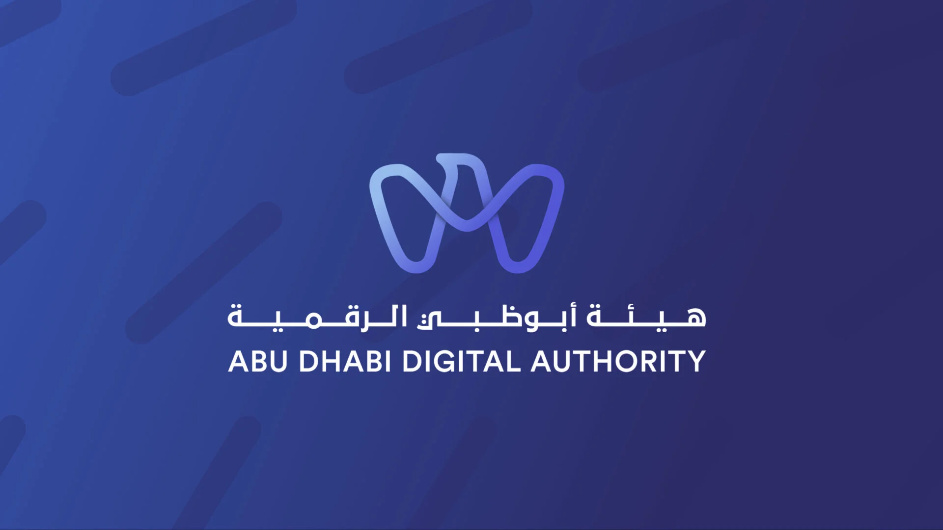
The next step focused on the design notes that already existed throughout Abu Dhabi and in Emirati society. The natural starting point was Qasr Al Hosen, which is the oldest building in Abu Dhabi built around 1790. With its iconic watchtower and walls that have stood the test of time, Qasr Al Hosn visually embodies the story of a nation that is secure, proactive, and united. As the iteration process unfolded, we began to see the falcon, which is a primary image in many Government seals in the UAE, as the perfect reflection of strength and perseverance needed to convey the critical mandate ADDA carries out.
By blending these images together, we were able to transmit the core principles that guide ADDA’s strategy in carrying out its mandate. After several refinements in collaboration with ADDA’s leadership, the logo was born. It’s power to convey the DNA of the organisation speaks for itself.
Taken as a whole, the logo is built upon tradition but looks to the future with open eyes. It is a reflection of the overall organisation strategy and ethos. It immediately conveys the sense of purpose and duty that guides ADDA’s work. Just as good design blends into the background, ADDA’s fresh branding convey’s this complex and profound history in a matter of seconds. It might look easy but the work doesn’t flow without a sense of duty and a passion to tell the story.